Once you have your wall in place, it’s time to start monitoring your progress through the project. Best done on a daily basis and best done with a “Finger Chart”. Here’s an example.
This chart may not make sense to you immediately but there’s a lot of useful data hidden in here. Here are the different inferences you can make by looking at a finger chart.
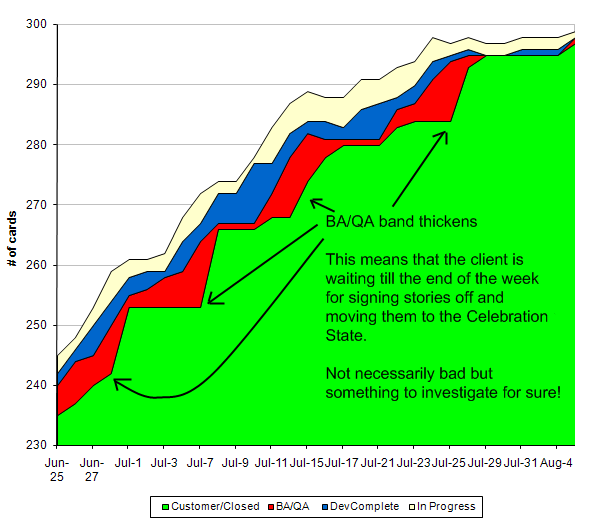
1) Bottlenecks
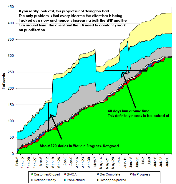
The first thing that you monitor on a finger chart is bottlenecks. This is easy. Just check for a band thickening consistently. A band thickening means that there is either a capacity problem or a capability problem in the next band. For example, the BA/QA band consistently thickens a suddenly rises at specific intervals. This is because the Client is signing off the stories only at the end of each week. This may be due to various reasons which need to be investigated to see if something is wrong OR can be made better. The ultimate goal is to achieve a smooth graph.
2) Work in progress
At any given point if you measure the total across all bands vertically, it will give you the total work in progress. This is a total of everything that needs attention from someone or the other on the team. Always try to keep this as low as possible. You should ignore the Celebration State for this calculation.
3) Average Turnaround Time
If you measure the time across all bands horizontally, you get the turn around time for a story. This is a good measure of your entire process. How lean your processes are, how good the team is, how involved and keen the client is, etc. This is what tells you how much time your team needs on an average to turn an idea into working software.
Remember that the finger chart is a cumulative of all stories. Therefore the top line of the graph should never dip down unless you have really reduced scope.
Now whether to track Number of Stories OR Story Points on a finger chart is an interesting debate. I will try to present my ideas on that in another post.
UPDATE : As David pointed out these are called Cumulative Flow Diagrams in the Lean world. Finger Charts is/was more of a ThoughtWorks term.
In Lean these are called Cumulative Flow Diagrams. They were first proposed for monitoring flow and WIP in product design by Don Reinertsen and first introduced into software engineering with my book, Agile Management for Software Engineering (draft manuscript in 2002).
Several of the Agile project management tool vendors support CFDs but they are sometimes referred to as "burn up" charts because of the bias of some early adopters of Scrum who wanted to name the chart to sound more like a Scrum artifact.
I love the examples you've posted. Thanks for sharing.
David